


 Photography: Shannon McGrath
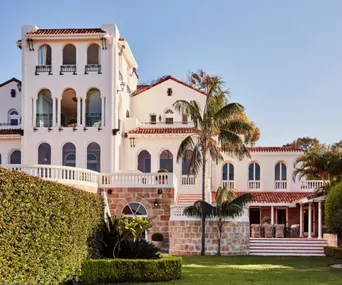
A flamboyant celebration of the Spanish Mission style, this grand condesa in inner Melbourne is in the pink after an inspired makeover by interior designer Carole Whiting. It respects a glamorous past while embracing an equally exciting, if more colourful, future. And, in that, art remains firmly in the picture.

When the owners bought the five-bedroom home in 2020, they were seduced by its fabulous features, relics of its days as a consulate, including cornices, ceiling roses, ornate internal doors and stained-glass windows, all blissfully intact.
And there was no shortage of space – a cavernous ballroom at the front and a previous extension at the rear took care of that – so much so the daredevil owner has rollerskated through those rooms! Yet despite its prestigious past, the home was far from perfect.
“It was certainly beautiful, with everything we want in a home, calming with a wonderful energy and in solid, triple brick,” says the owner. “But it was all so open, with that huge front ballroom, and so cold.”
Its neutral decor failed to fire the imagination and, despite the noble facade with its sweeping arches and portico, a bare, gravelled front yard dulled any sense of arrival. In short, it needed a personal touch.
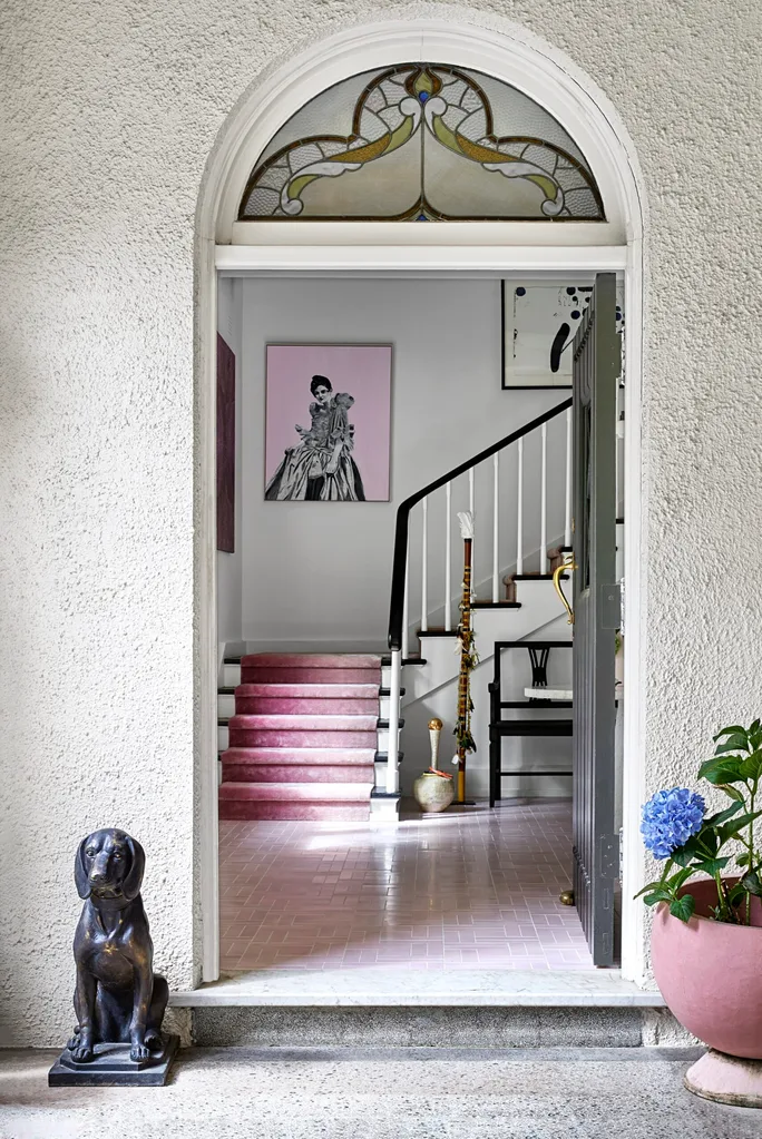
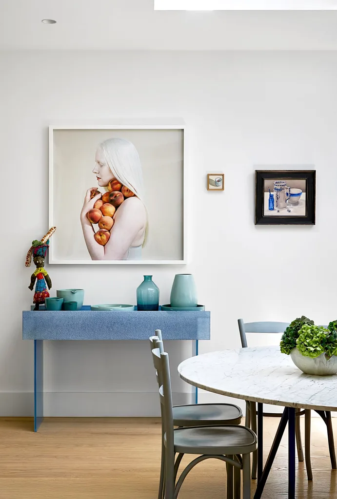
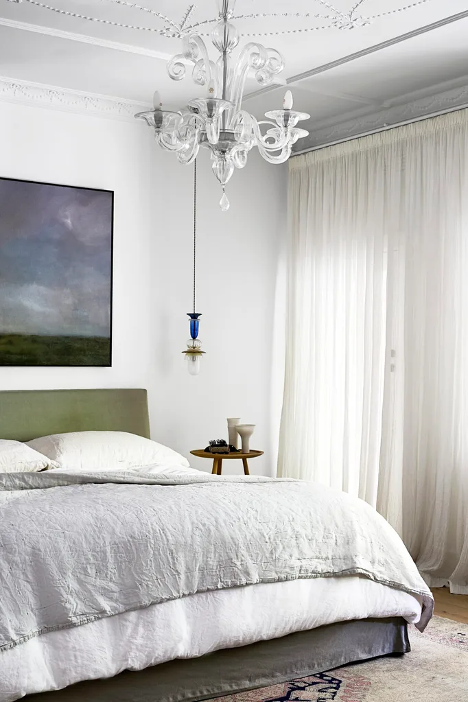
Quarter. Artwork on left wall by Maree Clarke. (Photography: Shannon McGrath)
“We have collected so many artworks and accessories over 30 or so years, which we wanted to accommodate to express our personalities,” says the owner. “But [the interior design] also had to be quite minimal and not too busy, to let the art do the talking. We didn’t really give Carole a brief.”
But there were two provisos: it had to respect the 1927 building’s glorious past, and reflect a passion for pink. “My husband loves pink – and the palette and overall feel flowed from there.”
Designer-with-a-mission Carole says: “We wanted to find balance in an art collectors’ home with an elegant and sometimes whimsical interior. Colour, texture and a nod to the heritage [of the house] form the narrative and provide interest while there’s plenty of breathing space to honour the artworks. The clients were keen for colour, but not so much as to detract from their artworks.”
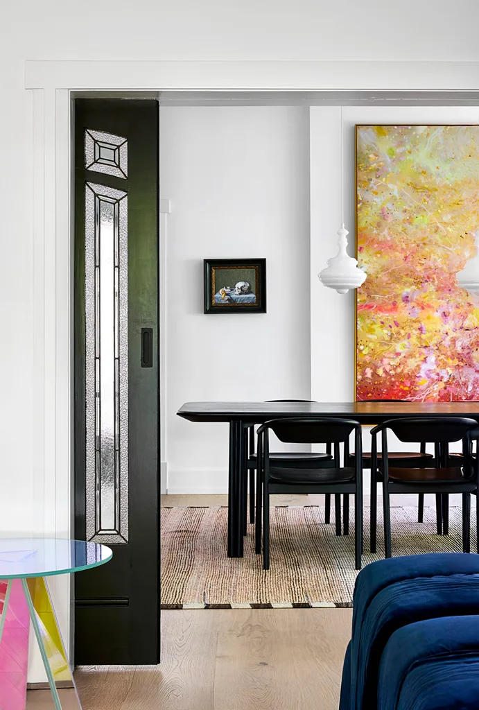
With minimal intervention – no need for any footprint changes or extensions – Carole played up the original features and added her unique twist. Metal internal doors now echo the original timber-framed versions, the latter beautifully restored.
“We used the older-style doors that lead from the dining room to the living room as a reference for all the new steel doors, plus a new kitchen window,” says Carole. “The doors visually link the spaces and balance old and new.”
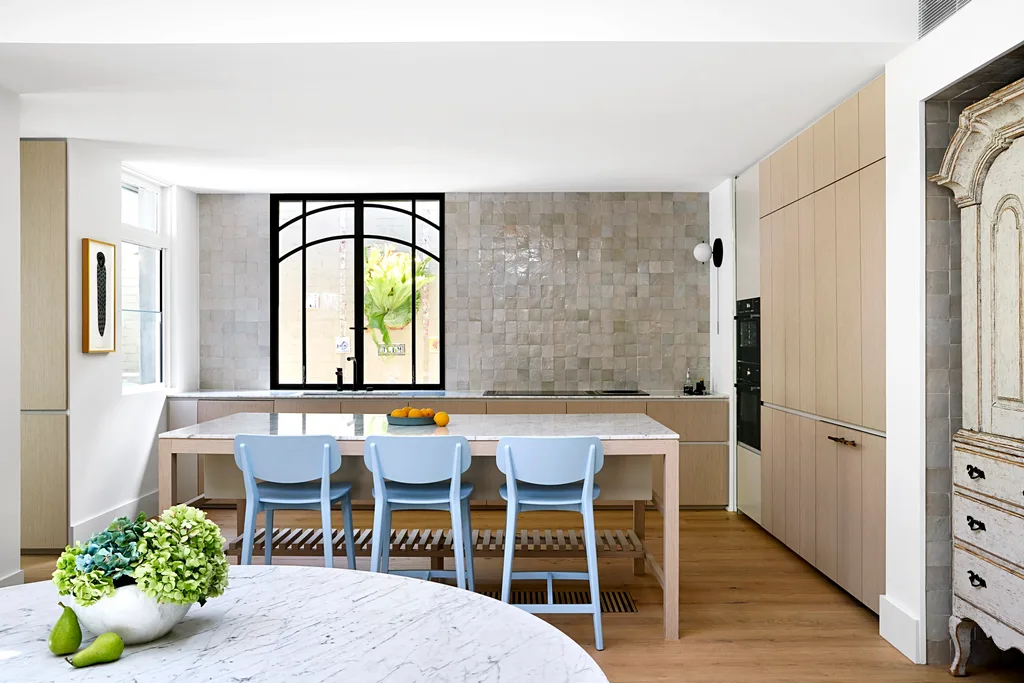
The kitchen was poorly laid out, with a partial wall separating it from the adjoining family area and creating a disconnect, so Carole removed that wall and let the room breathe. “The owner was keen for the kitchen to be a calm space with maximum functionality and I introduced an Art Deco reference in a seamless way with the steel window over the sink,” she says.
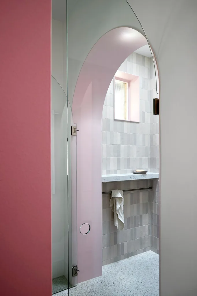
Space in the ground-floor bathroom and WC were limited, so she turned an existing shower into a powder room and reworked the rest by removing an unused bath and adding a generous shower with a skylight.
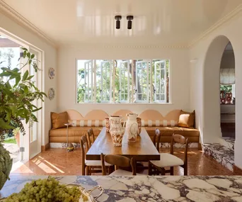
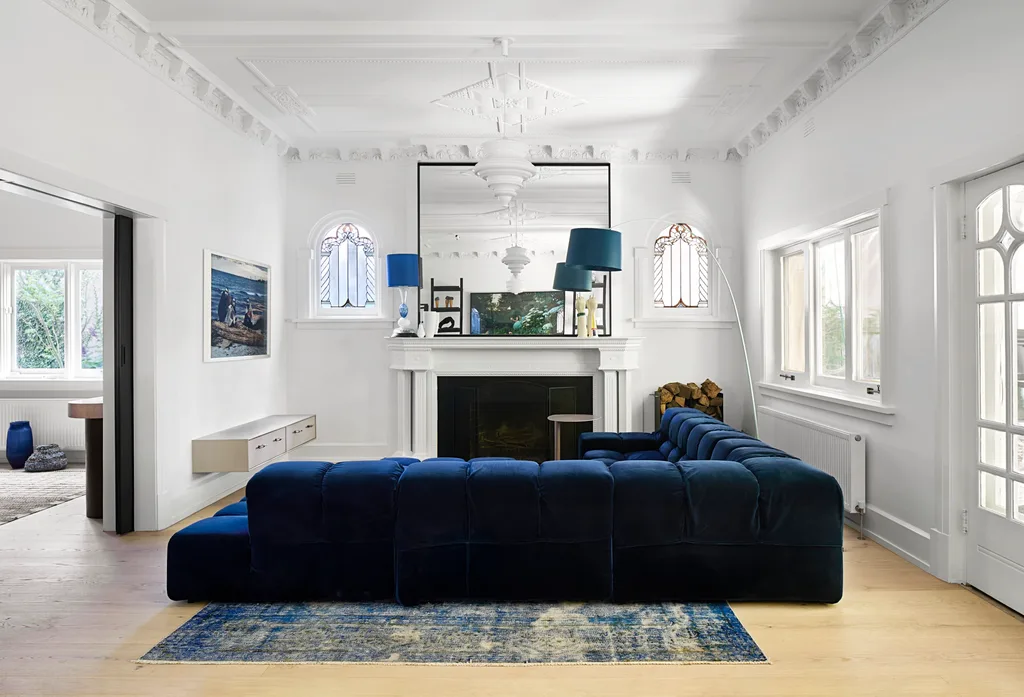
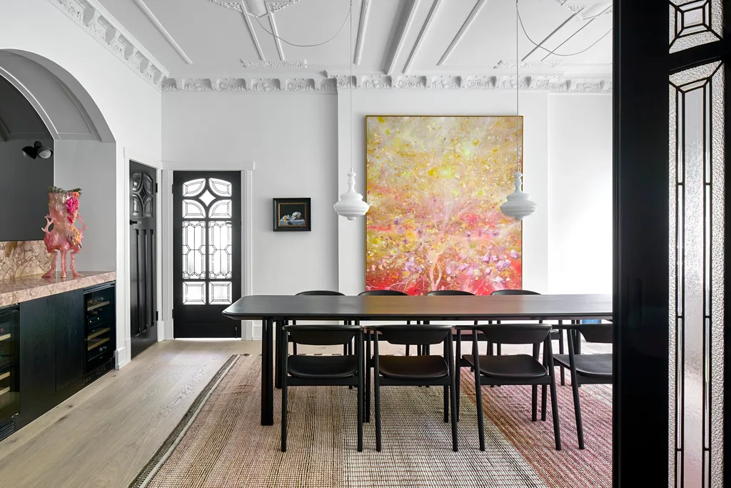
To the right of the entry is the former ballroom, reinvented as a living area, sectioned into two more intimate spaces by a massive ink-blue modular sofa. Beside that is the dining room, with a pink marble bar adding panache. Beyond steel doors, which define the transition between the original house and the later addition, sits the open plan, bathed in light by lantern-style clerestory windows above the informal dining and living areas.
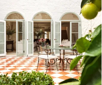
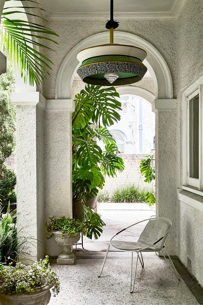
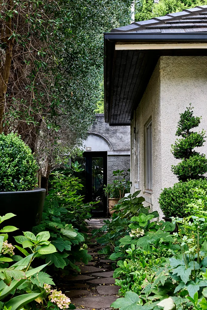
Banks of French doors lead to the rear yard, where a lush garden by Papworth Design elevates the outdoor area. Upstairs are two study spaces and two bedrooms (the third is downstairs).
Pink and blue define Carole’s colour scheme, while neutral monochromes allow the art collection to shine. Architectural features are often highlighted with colour, and furnishings either dominate or recede “to provide hierarchy and layering”.
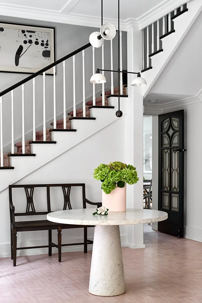
The entrance foyer is an indication of what is to come. A pink ombre stair runner and pink herringbone tiles rub shoulders with ever-changing artworks and sculptural lighting. The front living room boasts a formal pink velvet sofa at one end, counterpointed by a voluminous inky-blue modular at the other end.
Meanwhile, the dining room features pink marble joinery, a cocktail area with a tinted mirror, and a generous black dining suite which amply accommodates the many people who visit. “The owners are big entertainers – they like a party,” says Carole. “The colour is intense in some areas and softer where artworks take pride of place. And we used the black and white Art Deco vibe as a reference.”
Conversely, she kept the kitchen neutral “to provide breathing space, but the references are still there: a pink archway, traditional doors, and vintage and modern furniture pieces that sit in harmony”.
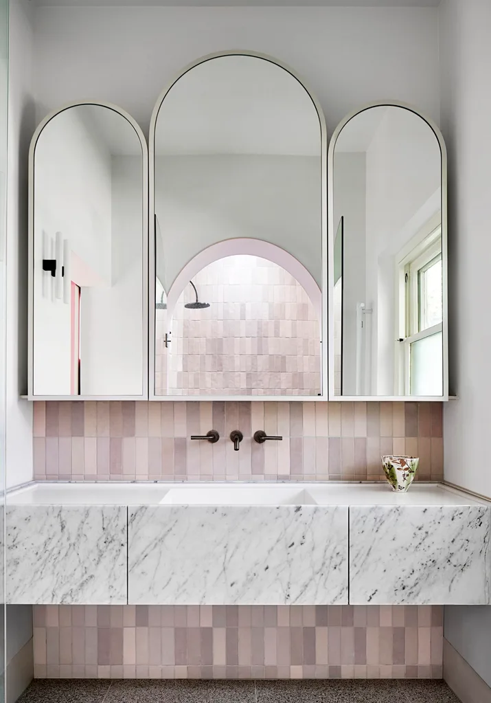
and showerhead from Mary Noall. Kaia ‘NEA’ wall lights from In Good Company. Mirrors, custom. (Photography: Shannon McGrath)
The owner’s favourite feature among many? The massive 18th-century Swedish cabinet from the Gustavian era in the kitchen, a treasured find that sits in its own specially tiled nook and predates this renovation. “It’s interesting and eclectic, and stops things being too modern and predictable.” Or too precious. “The entire house is not too cool for school,” she points out. “It’s a place that we – and our dogs – can live in, not a showroom. It feels like home, and it’s perfect for rollerskating!”
The Design Team
Studio Whiting: carolewhiting.com; @carolewhiting
Papworth Design: papworthdesign.com.au
Shop the look
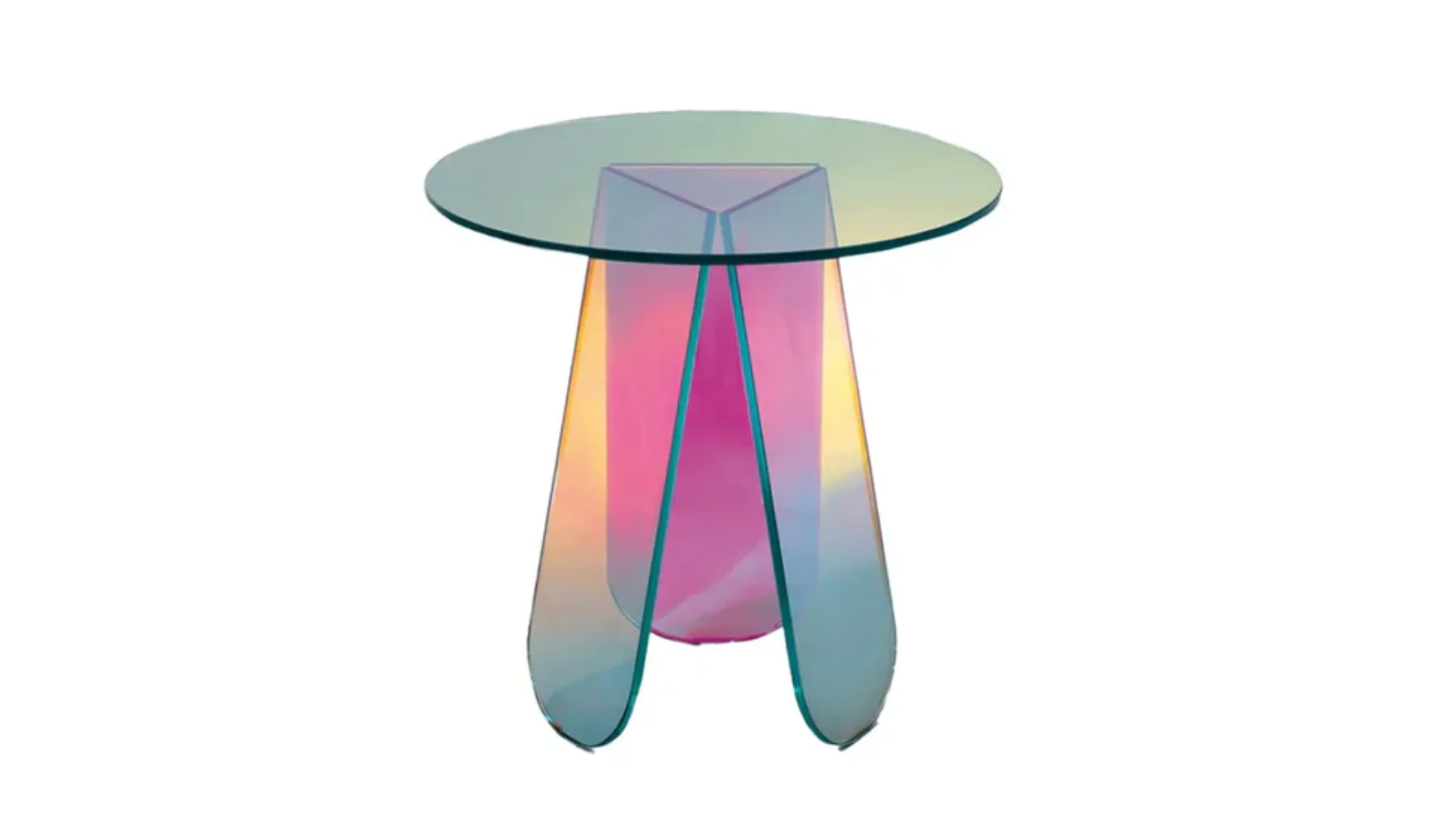
Glas Italia Shimmer Side Table
Space, $3,900
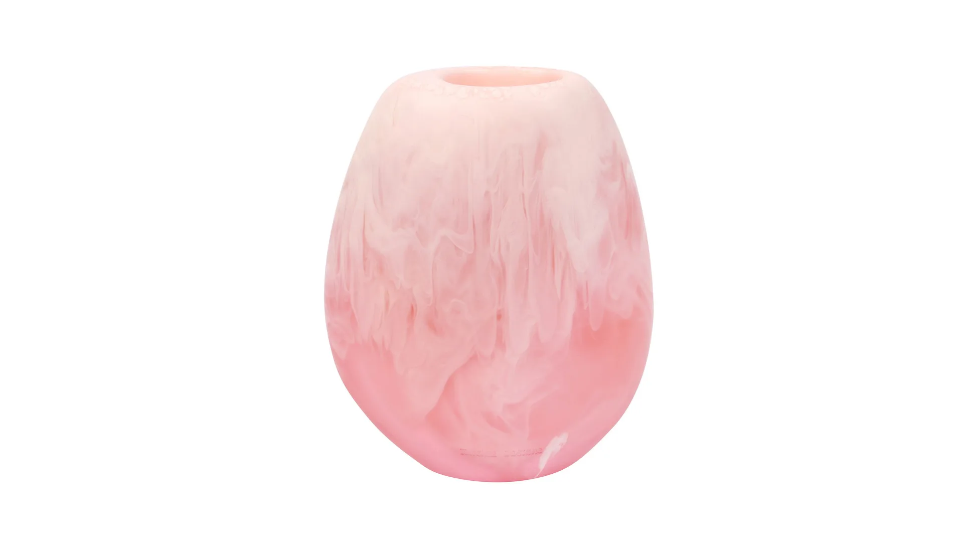
Skipping Stone Vase in Shell Pink
Dinosaur Designs, $170
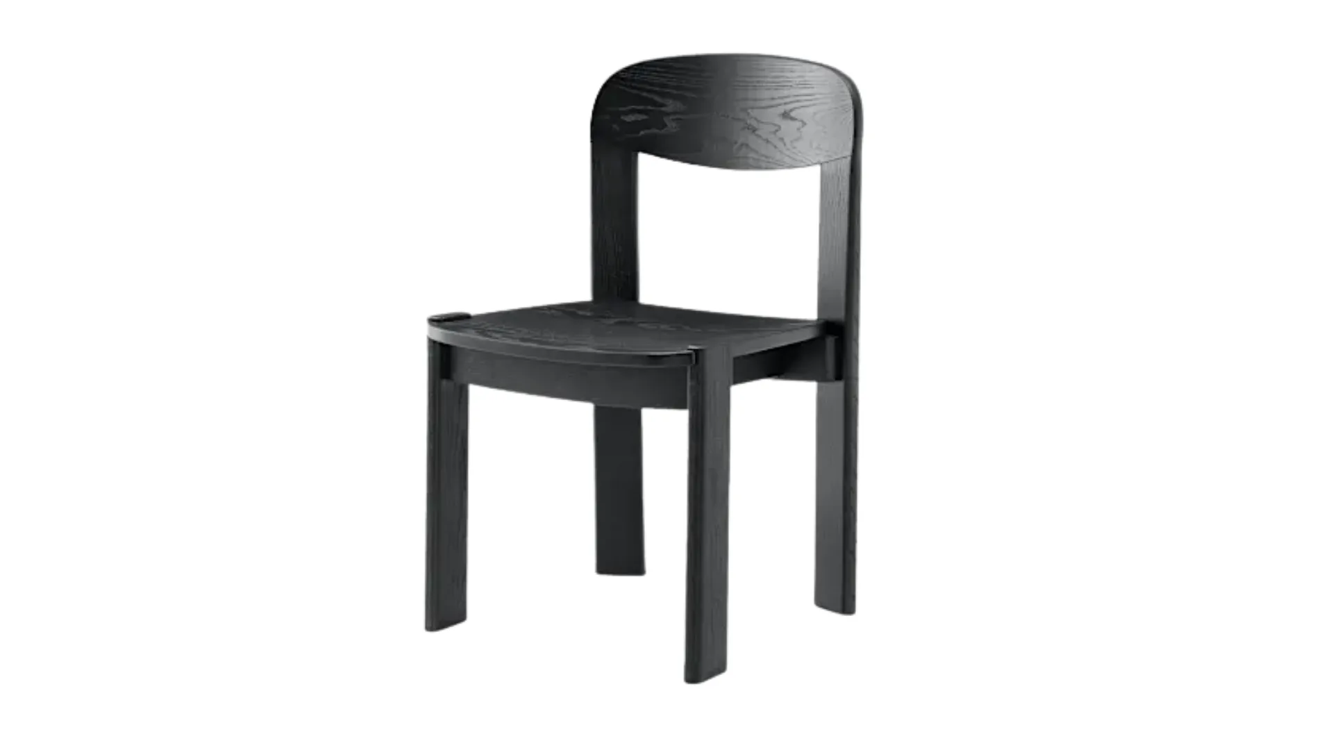
Anya Dining Chair in Black
Castlery, $698
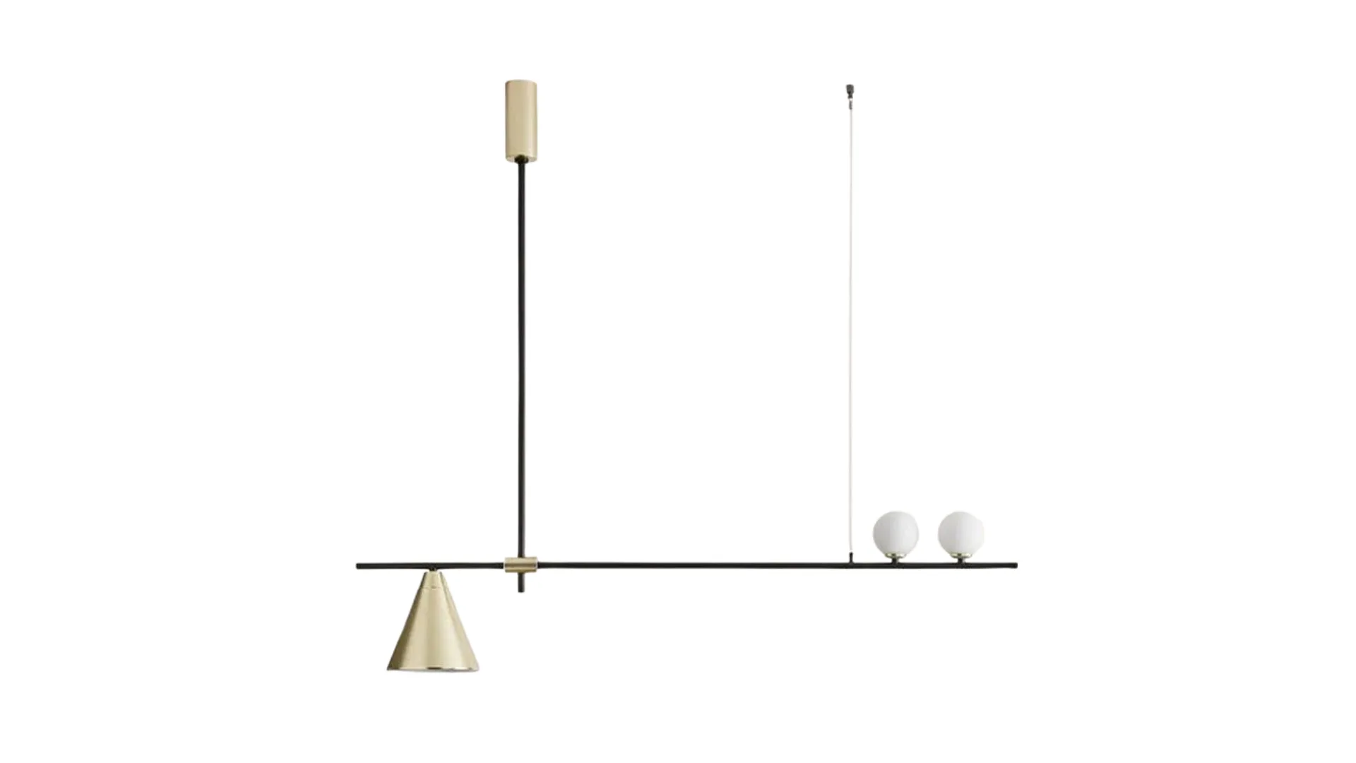
Crane Pendant Light
Trit House, $2,375