


The Block has finally wrapped its 21st season, located in Daylesford in the foothills of Victoria’s Great Dividing Range, and Britt and Taz transformed their ‘Block’ home into an oasis. With such a jam-packed series of renovation, it seemed like anything could happen, and happen it did. In the end though, the married couple, impressed the judges with an seriously layered home that was secured them the win. They ended up walking away with the title of Winners of The Block for 2025, in a gut-wrenching finale with mixed auction results, and an incredible $520,000 in prize money and profit after their Daylesford home sold for $3.41 million.
Britt and Taz’s style playbook
Britt and Taz’s modern-organic luxe home isn’t simply about decor and paint choices – it’s about architecture. Embracing a warm palette of creams, golds, and earthy tones and textures, they prove that the right material choices can bolster a home’s overall look and feel, and chose to design character-filled spaces that exude a sense of calm. Their success lies in material choices – textiles, timber, and warm metals – and a tight rein on colour, both of which give a sense of depth and luxury without feeling excessive. They’ve taken a minimalist approach to their design which, when it works, creates a sanctuary, but when it doesn’t, it risks blandness. Learning from Britt and Taz’s Block home so far, renovators can see that the key to a minimalist-luxe home is wielding restraint over the colour selection and textural choices, while also knowing when to let loose.
See more Block houses
Britt and Taz’s house from The Block

Front yard
Britt and Taz put up a good fight, but this week their creative risks fell flat where they should have soared. From a Grafico printed door that lacked cohesion and a lack of lush plantings, the judges found themselves searching for depth and finding none. Not even the dry creek bed or moonlight cinema could make things better as it took valuable time away from other, more impactful things. In the end, they landed at the bottom of the leaderboard, clearly not they way they wanted their last few weeks to go.

Outdoor area
From the multiple arbours, the lush, multi-zoned garden, to the outdoor lounge, pool and spa, and chic cabana, everywhere the judges looked in Britt and Taz’s outdoor area they saw amenities worthy of a high-end wellness resort. With a fireplace, sauna, ice bath, hot tub, games area, and even a chicken coop, every inch of their space was designed and considered. But, despite creating one of the most impressive and layered outdoor spaces of the season, the judges thought their design dipped slightly into “too much” territory. Go figure!


Alfresco
Britt and Taz’s alfresco looked every bit the entertainer’s dream, with a teppanyaki plate, barbecue, outdoor fridge and a generous dining zone. But without an essential piece of hosting furniture – a lounge – the judges couldn’t with a clear conscience call the space complete. Still, clever styling and comfortable amenities won them a few extra points.

Kitchen
The ceiling is the star of Britt and Taz’s sculptural kitchen. Punctuated by skylights and swathed in timber, the eye is instantly drawn upwards, emphasising the exaggerated ceiling height and making the room feel larger. Below, the workspace is swathed in stone and neutral tones, with material choices anchoring the kitchen in warmth and tactility. H&G’s stylist, Sophie Wilson agrees, advising that renovators should look to create balance in a kitchen. “Balance hardworking surfaces with gentle curves and colours,” says Sophie.

Kitchen and dining
Their kitchen offers impeccable layout and zoning, with their functionality a clear standout. From the oversized bench with waterfall stone edges, which offers flexibility for family living, to the island kitchen layout, which ensures flow between rooms, it is a carefully planned space that promotes connection across the open-plan living areas.

Open-plan living and dining
Britt and Taz’s open-plan living and dining area feels grand and expansive without losing its intimacy. The timber-lined ceiling, punctuated by skylights, draws the two rooms together and creates a sense of unity, while the repetition of neutral and wooden accents seen throughout the rest of the home reinforces this cohesion. This is a valuable lesson that, when it comes to styling large spaces, a consistent material palette can imbue a sense of continuity and warmth.

Living room
Though Shaynna questioned the layout, Britt and Taz delivered a serene living room that they felt captured the essence of Daylesford. A stacked-stone feature wall paired with timber details evokes a country sensibility, while the neutral palette aligns with their modern organic-luxury brief. Functionally, the built-in bench makes smart use of an otherwise redundant corner, adding both practicality and charm.

Dining room
Meanwhile, the dining space is a strong space, with an oversized timber table that echoes the tones of the detailed ceiling above. A hanging pendant adds a touch of softness that perfectly matches the dining furniture it hangs above. This room illustrates how thoughtful proportions and restraint when styling can make a room feel luxurious.

Pantry
Britt and Taz’s very aesthetically pleasing pantry was awash with neutrals to match the kitchen, from the large floor tiles to the rattan styling of the open-plan shelving, which gave the space a calming feel. Praised for its sensical layout and plentiful shelf space, this room was an easy winner for the judges.

Laundry
A space that Darren couldn’t help but describe as “sexy”, their choice of appliances and gorgeous styling made this laundry both functional and practical. Delivering on storage, functionality, and polish, and commercial-grade washer and dryer units to boot, this was an impeccably designed laundry that potential buyers would love.

Garage
Next was the garage, a true “wow” moment for the judges, with gold-painted walls, Bromley artwork, and an impeccable lighting plan that saw Darren, Shaynna and Marty’s eyes light up. But it wasn’t just beautiful, Britt and Taz saw to it that the dirt- and grease-resistant floor panels were as functional as they were beautiful.

Wine cellar
Britt and Taz’s shed, split into two with a tool zone on one side and a well-finished speakeasy on the other, was a winner with the judges. An excellent way to try the local drop, and a space that Marty described as “pretty bloody cool”, the interior was dark, sexy and true to the look and feel of country Daylesford. But it wasn’t without one major fault, as Shaynna questioned the room’s compliance.

Water closet
A beautiful water closet, this showstopper space embraced the pink hues from the marbled stone vanity to the colour-drenched walls to create a cohesive design. More art-like lighting pieces tied the whole space together, placing Britt and Taz on a high.

Main bedroom
Britt and Taz’s main bedroom champions natural textures and showcases a mastery of materiality, anchored by the sweeping bedhead in a rich golden fabric. Styled with complementary tones, curved lines, ribbed wall panelling and soft furnishings, the room feels anchored and intentional, proof of the impact a single, well-chosen feature piece can have. Though neutral in palette, the layering is deliberate: variations in texture, from the velvet armchair to the ribbed walls, create depth and invite you in. A skylight fills the room with natural light, while pendants above the armchair and additional lamps build warmth and defines zones.

Walk-in wardrobe
The adjoining robe continues the theme: refined yet luxurious. What could have felt purely utilitarian is softened by the fringed chandelier overhead and the flush cabinetry with minimalist detailing. For renovators, the lesson here is restraint: simplify your joinery to allow for textures and proportions to do the heavy lifting.

Main bathroom
Britt and Taz’s main bathroom uses the layout to create two separate, luxurious zones. In a considered floor plan, they chose to have the shower tucked away behind a fluted glass door in an expansive wet room, featuring a curved seat, large skylight and retro-inspired tiles. This layout transforms the bathroom from purely functional into a secluded personal retreat. The muted tones, different textures and natural materials further reinforce the serene feeling of this room. They’ve chosen a single warm, earth-toned colour palette that ranges from pale blush walls to deep terracotta floors to create cohesion throughout. This complements their material execution, where fluted glass, the timber vanity, ribbed ceramic tiles and handmade-style wall tiles combine to create a tactile richness.
Styling tip! How to design a luxurious bathroom layout:
1. Create distinct zones without closing off the space
By dividing their room into two main areas: the vanity and wet room, Britt and Taz have made the functional space feel like a secluded escape. If you have the space, consider creating zones within your bathroom for a more serene experience.
2. Integrate features to increase your footprint
Smartly integrated elements can make a bathroom feel bigger and more open. Consider features like Britt and Taz’s skylight or their integrated shower seat, both of which remove visual clutter and make the floor plan feel more generous.
3. Use complementary finishes to create a visual flow
Finishes, fixtures and details should work together across the whole space – including from one zone to the other. Carrying the same materials from the vanity area to the shower zone will create visual cohesion and make the two areas feel connected.

Guest suite
Britt and Taz took a layered approach to styling their guest suite, expertly playing with tactile finishes, soft curves, and a material palette that feels cocooning and sophisticated. A standout feature, to mixed reception, was the rustic timber panelling around the perimeter of the bedroom: some loved it while others thought it unnecessary. The bedside tables were a crowd-pleaser and the tonal harmony of the muted terracotta bedhead, twin lounge chairs and sandy walls an expert colour pairing. But, the undersized wardrobe storage let them down. The blows kept coming, with the unfinished bathroom cementing their last-place result.

Guest kitchenette
A perfect inclusion for any renovator looking to add value, their guest kitchenette – complete with fridge, microwave, kettle, and toaster – meant that the whole suite could eventually be fully self-contained. With its calming palette and restrained under-cabinet lighting, the kitchenette is the perfect spot for guests to make a morning coffee or sneak a midnight snack without disturbing the rest of the house.

Wellness retreat
While not a rumpus room in the traditional sense, Britt and Taz’s take on this week’s room was arguably just as retreat-worthy as their fellow contestants – despite what the judges said. Cautioning the couple against their choice to sacrifice a second living area in favour of a self-contained Pilates studio, the judges expressed their concerns about what it meant for their overall floor plan. Draped in undulating fabric from floor to ceiling, the wellness retreat created by Britt and Taz sought to cement their point of difference from the rest of the group and delivered just that with this luxurious look. “A bold move, however we believe this elevates House 3,” says local real estate agent, Buxton Ballarat’s Mark Nunn. “A wellness room is the perfect luxury item if you have the space. We believe this room is a real point of difference for House 3.”

Wellness retreat
Two arched full-length mirrors offer the ultimate home-gym experience in the couple’s wellness retreat, replete with ample natural light, built-in television and its own hydration station. Whether you’re a Pilates regular, or just a casual class goer, the room is inspiration enough to get back into the gym with gusto.

Kids’ bedroom
The perfect space for two young kids, Britt and Taz’s kids’ bedroom combines traditional patterns with modern elements to create a timeless look. From the striking checkered wallpaper to the muted camel palette and warm timber elements, this bedroom feels fresh, inviting and certainly age-appropriate. The repetition of soft materiality in the textiles, plush green rug and cushioned ottomans make the room feel comfortable, and choosing two single beds ensures flexibility and create a sense of symmetry. But overall, Britt and Taz’s decision to pair the typically traditional pattern in the wallpaper with more modern and playful styling elements is what gave the room the visual impact it needed and helped tie it all together.

Big kid’s bedroom
For a more grown-up take on a kids’ bedroom, Britt and Taz’s second bedroom centres around the feature mural in undulating shades of terracotta, an ode to beautiful rolling landscapes. These curves are seen again in the bedhead, wavy full-length mirror and wardrobe door handles, which, when paired together, creates a sense of continuity and flow. A palette of blush, rust and creamy neutrals, and the sheer curtains with soft diffused light creates a serene atmosphere, making it a space you’d want to retreat to after a long day. Britt and Taz expertly use form and colour to create a sense of movement and tranquillity, where curved lines and organic shapes make the room feel, at-once, soothing and on-trend.
Styling tip! How to make a kid’s bedroom feel more playful:
1. Pair traditional elements with modern styling. A kids’ bedroom doesn’t have to be 100% playful to feel youthful, it can be a mix of traditional elements, unique styling pieces, and pieces that reflect the child.
2. Don’t shy away from a feature element. One bold element can anchor the entire room, adding instant depth and personality. Consider choosing a feature element that isn’t too trending as these can become dated quickly.
3. Embrace the curves. Soft, rounded waves, curves and arches work extremely well in kids’ bedrooms, adding a sense of whimsy, softening the lines of a room and helping it feel safe and cosy instead of sleek and harsh – perfect for winding down at night or for playtime.

Bathroom
Britt and Taz’s bathroom feels both luxurious and liveable, and is filled with natural light thanks to the oversized skylight overhead. The couple curated their material choices for a rich, layered effect, from the fluted glass shower screen to rough hand-finished tiles and smooth stone vanity, and the result is a sensory experience that doesn’t rely on a bold colour palette for its visual impact. Complementing the subdued colour palette, the fluted timber vanity introduces warmth to the room, which, paired with soft LED lighting and reflective material choices, creates a luxurious, calming atmosphere. Taking the same floor tiles from the bathroom into the shower merges rather than delineates the two zones, making the whole room feel larger and more cohesive. That, paired with the gentle curve of the wall mimicking the curves of the freestanding bath, gives the room a sense of visual continuity. But watch out for the gaps between the bath and the wall; such a tight space can make it impossible to clean.
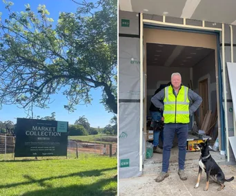
Who are Britt and Taz?
The pair charged with renovating House 3 on The Block 2025 are police officers, Britt and Taz. Both aged 30, they are a married couple from Newman, a town in Western Australia, and parents to their two young kids: Carter, 4, and Myla, 2. From day one, they’ve defined their style as ‘Modern Organic Luxury’, but how well does that translate in real life?
See their full listing at 3 Cedar Lane, Daylesford VIC 3460. These images were originally published on nine.com.au/TheBlock.